We now turn to what I term the “major” technical awards. While I recognize that the vast majority of moviegoers couldn’t care less about evaluating a film’s editing or production design, I honestly believe that the following categories are critical to a picture’s success (or, in some cases, failure). Do I have any evidentiary basis for this belief? No. That’s why I chose not to attend film school, so I can continue making bald claims about cinematic values without having any educational pedigree with which to defend them. It’s more fun this way. Alright, let’s get to it, starting out with most important technical award of the entire ceremony.
BEST CINEMATOGRAPHY
Avatar – Mauro Fiore
Harry Potter and the Half-Blood Prince – Bruno Delbonnel
The Hurt Locker – Barry Ackroyd
Inglourious Basterds – Robert Richardson
The White Ribbon – Christian Berger
WILL WIN
Harry Potter. Just kidding. But this is a doozy of a category to predict, with all contenders other than our burgeoning boy wizard possessing a legitimate chance. Still, if forced to eliminate a second nominee, I’ll strike down Inglourious Basterds next. Richardson is an inveterate photographer – this represents his sixth Oscar nomination, and he’s already won twice (for JFK and The Aviator) – but I think Tarantino’s film will garner more recognition for its audacious storytelling and historical tinkering than its craftsmanship.
That leaves an intriguing triangle of contenders. Two are Best Picture heavy hitters with a combined 18 nominations, while one is a foreign film with only one other credit on its Oscar resume. One is shattering global box-office records daily, while the other two combined for less than $15 million. One is photographed in stark black-and-white; one pops off the screen in startling, fantastical, three-dimensional color; and one traffics in the gritty, earthy tones of desert warfare. And all are, in their own unique way, beautiful.
In the end, it really comes down to the voters’ tendencies as opposed to the quality of the cinematography at issue. Do they reward the tech-heavy Avatar, the all-around excellence of The Hurt Locker, or the chilling austerity of The White Ribbon? I’ll roll the dice with the eye-popping giant and predict Avatar. But note that if The Hurt Locker wins here, it automatically becomes the champion for Best Original Screenplay. That’s just how this stuff works.
SHOULD WIN
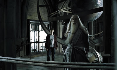
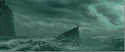
This is a three-picture race for me as well, although I’m eliminating The Hurt Locker (whose photography is impressive but secondary to its heart-thumping action scenes) and replacing it with Harry Potter and the Half-Blood Prince. While I happily acknowledge my obsession with all things Hogwarts, my bias doesn’t diminish the delicate, haunting beauty of Bruno Delbonnel’s compositions. Even darker than its predecessor, Half-Blood Prince at times looks as if it’s set under a permanently clouded sky, with omnipresent shadows stretching in every direction. Delbonnel continues his precursors’ technique of desaturating color for dramatic effect; the climactic cave sequence is so leeched of color that it’s virtually in black-and-white (at least until a roiling orange fireball explodes out of the heavens). He also delivers perhaps my favorite shot at the movies the entire year, when a concerned Harry slowly descends a staircase to comfort Hermione, and we see him only in shadow. It’s a sad, elegant moment in a movie full of them.
Of course, if Half-Blood Prince occasionally dips into subdued hues, The White Ribbon is permanently muted. The decision to shoot in black-and-white makes sense; the film’s premise is that our world is devoid of life and color, so its palette might as well suggest the same. In addition to some magnificent static shots, Christian Berger frequently delivers extraordinary long takes on the move (complying with Michael Haneke’s fondness for lengthy shots), and his camera never slides out of frame.
Still, I can’t vote against Avatar. One can debate just how much actual photographing Mauro Fiore performed, but the end result is undeniably majestic. Every shot in Avatar is immaculately composed, yet none is listless or inert. The film shows us a land of incomparable richness, and Fiore’s cinematography superbly captures how it teems with life.
DESERVING
Duplicity – Robert Elswit. There’s a scene in Duplicity in which Julia Roberts is sitting at a table in the foreground, while Tom Wilkinson looms behind her in the background, delivering some cockamamie speech about the invention of fire. It is one of the most perfectly composed images I have ever seen. Both actors are in the exact center of the frame, the spacing is perfect, and every inch of what we see just radiates with clarity and precision. It’s as if it came out of a Coen Brothers film.
A Serious Man – Roger Deakins. As I said.
Public Enemies – Dante Spinotti. Many purists complain about Michael Mann’s embrace of digital photography, but it doesn’t bother me. Regardless of the specific technique applied, I can’t deny the photographic excellence of the movie’s extended final scene, where Spinotti’s camera tracks Johnny Depp through a smoky haze until he reaches his demise. It’s a spectacular sequence that should demolish any concern about the limits of the digital revolution.
Star Trek – Daniel Mindel. In addition to the specific shots I mentioned in Half-Blood Prince and Duplicity, one of my favorite images of the year occurs in the opening sequence of Star Trek. It’s a shot of two spaceships: one an enormous, seemingly teething Romulan ship, the other a tiny, speck-like figure that is the U.S.S. Kelvin. The two are on opposite sides of the screen, only the Romulan ship is so massive that it appears poised to devour its prey. The movie itself isn’t quite as remarkable as its fans would attest, but this shot is sci-fi filmmaking at its apex.
BEST ART DIRECTION/SET DECORATION
Avatar
Nine
Sherlock Holmes
The Imaginarium of Doctor Parnassus
The Young Victoria
WILL WIN
In case you aren’t a rigorous student of the Academy’s irrational lingo, “art direction/set decoration” really means “production design”, which essentially translates to the following question: “Which of these five movies features the best sets?” That introduces a thorny complication this year because Avatar – the one film destined to dominate the technical categories – doesn’t really have any sets. At least not in the physical sense – most of the movie’s environments were created in a computer. But I still think it has the edge here, if only due to its meager competition. Nine‘s buzz has fizzled completely, while I’m skeptical how many voters even watched The Imaginarium of Doctor Parnassus (its nomination is its own reward). The Young Victoria could be a sleeper, but I think most voters will pay homage to its costume design instead. Sherlock Holmes is the lone challenger that did big business and relied appreciably on a cagey, idiosyncratic production design, but it didn’t feature any floating mountains. Avatar takes it.
SHOULD WIN
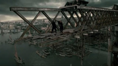
With the exception of a gorgeously empty stage in its opening musical sequence, Nine‘s sets are hardly laudatory, while The Young Victoria could take place in any stately British manor house. As with many of Terry Gilliam’s pictures, The Imaginarium of Doctor Parnassus certainly features some impressive, enigmatic creations, but none was overly memorable. Sherlock Holmes, on the hand, stages its lengthy action climax atop the half-finished Tower Bridge in London, one of the most visually arresting sequences of the year.
Now, I’m on record as being a huge fan of Avatar, but I actually think the curmudgeons who protest its recognition in this category have a point. Sure, what we see is spectacular, but that’s primarily courtesy of the film’s extraordinary visual effects technicians. That said, obviously someone designed those environments in conceptual form before they became binary code, so I don’t want to prejudice against them solely due to their lack of corporeality. But it can be a mitigating factor, and in addition to that Tower Bridge sequence, Sherlock Holmes has an awesomely Gothic look to it overall, with musty buildings and smoky alleyways. Its storyline may be a tad incomprehensible (and irrelevant), but it looks damn sweet.
DESERVING
District 9. Part of me is scared to ask, but are those slums where the government forced the aliens to live actual slums? They sure look real.
Harry Potter and the Half-Blood Prince. Scariest. Cave. Ever.
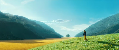
The Lovely Bones. Consider this a tandem pick with Avatar. Its evocation of a young girl’s personal Heaven is mostly computer-generated, but it is nevertheless a remarkably original place.
Public Enemies. If this movie didn’t feature Michael Mann’s distinctive glossy, high-definition camerawork, I would absolutely believe that it was shot in the 1930s.
The Road. Maybe the biggest omission of the group. No 2009 film relies more on the atmosphere of its surroundings, and The Road‘s sets expertly conjure the movie’s central elements of bleakness and desolation.
A Serious Man. The Coen Brothers are renowned for their mutability, but as craftsmen, they’re incredibly consistent perfectionists. The period setting here, this time recalling the mundanity of 1960s Middle America, is another impeccably detailed feather in their production design cap.
BEST FILM EDITING
Avatar – Stephen E. Rivkin, John Refoua, James Cameron
District 9 – Julian Clarke
The Hurt Locker – Bob Murawski, Chris Innis
Inglourious Basterds – Sally Menke
Precious – Joe Klotz
WILL WIN
I’m notoriously inept at predicting this category, possibly because I invariably disagree with the Academy’s final selection. Just to make things even more challenging this year, all five nominees are also Best Picture contenders (a first since 2003), so it’s not as if any can be automatically discarded. So fuck it, I’ll just play the “Clash of the Titans” card and call this a race between Avatar and The Hurt Locker. And unlike with most of the technical categories, I’m going to put my money on the war movie here. Why? Because I’m a moron and can’t help picking the candidate I actually think deserves to win. I think Avatar is a terrific movie, but it’s two and a half hours long, whereas The Hurt Locker is an incredibly taut war thriller. Will the Academy recognize this? Probably not, given that this is the same organization that bestowed an editing Oscar on The Lord of the Rings: Return of the King even though people were openly walking out during that movie’s interminable final 22 minutes (and let’s not forget they failed to nominate Return of the King for a cinematography Oscar that same year – never forget this). But for no particular reason, I’m feeling optimistic.
SHOULD WIN
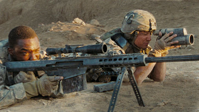
The Hurt Locker, and in a cakewalk. This is the kind of picture that defines stupid sound bites like “white-knuckle action!” and “you’ll be on the edge of your seat!”. Sure, those are inane, overused clichés, but they actually apply here. The majority of The Hurt Locker truly is excruciatingly suspenseful, and Bob Murawski’s and Chris Innis’ editing plays a central role in elevating and sustaining that tension. This isn’t a competition, it’s a coronation. At least, it should be.
DESERVING
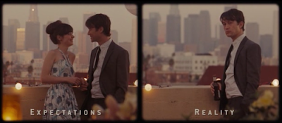
(500) Days of Summer – Alan Edward Bell. First time director Marc Webb brings a considerable amount of flair (pomposity?) to his debut, and Bell assists him ably. The “Expectations vs. Reality” sequence in particular is a superlative example of how canny film editing can ensure a filmmaker’s vision effectively reaches his audience.
Drag Me to Hell – Bob Murawski. Quite a year for Murawski. When he wasn’t ratcheting up the tension in Iraq, he was terrifying Americans on the home front while cutting this throwback horror flick. “BOO!” “GASP!” “Where’d she go?” “AHHHHHH!”
Duplicity – John Gilroy. Tony Gilroy’s brilliantly convoluted screenplay features its share of twists and turns, but his younger brother John makes certain we never get lost in the labyrinth.
The Informant! – Stephen Mirrione. The Informant! conveys a tremendous amount of, ahem, information, but instead of feeling like a turgid documentary, it remains consistently energetic and surprisingly suspenseful. Mirrione helps us avoid getting bogged down in the details so we can instead enjoy the unanticipated contours of the narrative.
Up in the Air – Dana E. Glauberman. I generally disfavor rapid-cut sequences, but Glauberman employs them in perfect measure here, emphasizing with vitality the main character’s habitual lifestyle.
BEST VISUAL EFFECTS
Avatar
District 9
Star Trek
WILL WIN
There are certain Oscar categories in which I need to expend a great deal of verbal energy describing all of the potential scenarios, addressing any preexisting voter biases, analyzing historical Academy trends, and generally engaging in stupendously thoughtful analysis that may or may not be total bullshit.
This is not one of those categories. Avatar wins, in the biggest lock of the night.
SHOULD WIN
Star Trek‘s effects didn’t do too much for me, but I’d be remiss if I didn’t commend the technical wizardry of District 9. There are great effects that are clearly effects, and then there are great effects that are invisible. It’s the latter where technical innovation translates to filmmaking success because the audience can focus on the story rather than being distracted by the novelty. The prawns (er, aliens) in District 9 are all computer-generated, but they lack any digital identifiers. Instead they blend seamlessly into their environment, so when we’re watching them, we aren’t nodding admiringly about how impressively they’re rendered; we’re listening to them complain about persecution. And that’s the signifier of truly excellent visual effects.
Given that, is it somehow possible that District 9‘s visual effects are remotely as impressive as those on display in Avatar?
(I’m thinking.)
No.
DESERVING
The Lovely Bones. Ideally, this would be a tandem nomination along with Best Production Design (grr, I mean Best Art Direction/Set Decoration). Regardless of the category, Peter Jackson’s vision of Heaven (or wherever it was) is startlingly surrealistic, and more than memorable.
2012. Let’s face it: That scene where John Cusack is driving madly down a Los Angeles highway and an earthquake is literally chasing him all the way … well, that’s pretty sweet.
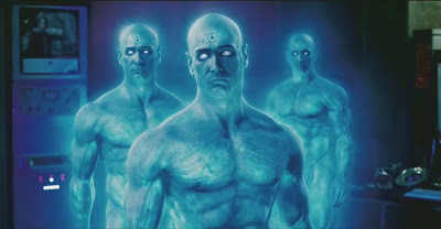
Watchmen. Did I like the movie? Not exactly. Does Billy Crudup look badass as a gigantic floating bald blue radioactive superhero? I’d say so.
BEST ORIGINAL SCORE
Avatar – James Horner
Fantastic Mr. Fox – Alexandre Desplat
The Hurt Locker – Marco Beltrami & Buck Sanders
Sherlock Holmes – Hans Zimmer
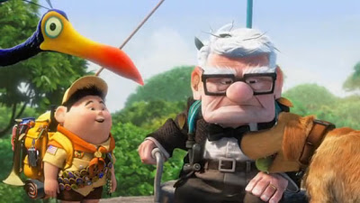
Up – Michael Giacchino
WILL WIN
Intriguing. Fantastic Mr. Fox and Sherlock Holmes are both out, and I’m willing to discount The Hurt Locker as well despite its Best Picture nomination – its score is just too abstract to take home a statuette. That leaves Avatar vs. Up, and while I consider Avatar the primary heavyweight for technical categories, I’m not convinced Horner’s music has enough depth to claim victory here. Instead I’ll roll the dice on Giacchino’s Up, which has been performing well on the circuit and features a sweet, life-affirming theme called “Married Life.” No composer has won for scoring an animated feature since the incomparable Alan Menken for Pocahontas. Giacchino ends the drought.
SHOULD WIN
Meh. I’ll be honest, I’m not too impressed with any of these selections, which is a shame, given that this is usually one of my favorite categories. The Hurt Locker‘s music may be functional in its setting, but it’s hardly awards-worthy. For Sherlock Holmes, Hans Zimmer (normally one of my favorite composers) has created a twitchy, off-kilter mix in the vein of his “Jack Sparrow” theme from Pirates of the Caribbean: Dead Man’s Chest; it’s an interesting sound but one short on musical sustenance. Alexandre Desplat’s score for Fantastic Mr. Fox is similarly jangly, and it aligns nicely with the film’s restless nature, but that doesn’t make it enjoyable (frankly, I vastly preferred Desplat’s work on The Twilight Saga: New Moon). As for Up, it’s an adequately pleasant score, but aside from a few emotionally stirring moments, it lacks bravura.
So I suppose I’ll go with James Horner’s score for Avatar. It’s far from the prolific composer’s best work, but at least it features some robust themes.
I just can’t help feeling disenchanted, especially given that the Academy failed to recognize the best score of the year, which was …
DESERVING
Star Trek – Michael Giacchino. Whoopsies, the voters picked the wrong Giacchino score. And boy did they miss a good one. Star Trek isn’t just my favorite score of the year – it’s one of my favorite scores of the entire decade, along with Dario Marianelli’s music for Atonement and Patrick Doyle’s score for Harry Potter and the Goblet of Fire. Replete with booming brass and howling horns, it’s unabashedly bombastic music, but that’s what makes it so terrific. Failing to recognize this score constitutes one of the Academy’s biggest misfires of 2009.
A Single Man – Abel Korzeniowski (with Shigeru Umebayashi). You might think that an elegant period piece (made by a fashion designer, no less) would feature complacent, overly prettified compositions. That’s what makes the urgency of Korzeniowski’s string arrangements such a welcome surprise.
Moon – Clint Mansell. It might not match his nightmarish overture from Requiem for a Dream, but Mansell’s “Welcome to Lunar Industries” theme is insidious in the best possible way.
Coming up next: the screenplays.
Jeremy Beck is the editor-in-chief of MovieManifesto. He watches more movies and television than he probably should.

