Teenage Mutant Ninja Turtles: Mutant Mayhem: The Tortoises and the Flair

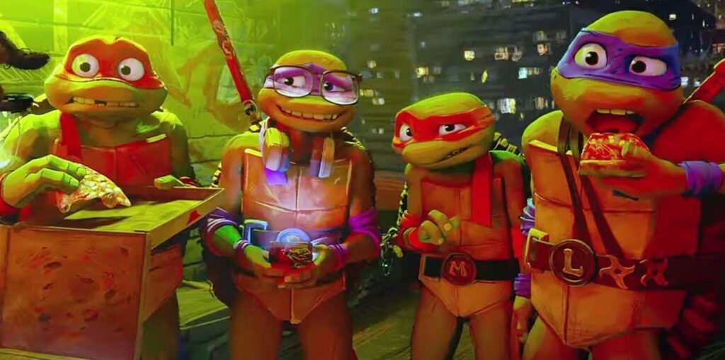
A scene from Teenage Mutant Ninja Turtles: Mutant Mayhem

The success of the Spider-Verse pictures has ushered in a new style of animation that doesn’t yet have a name. Where the computerized creations of Pixar and its ilk exhibit hyper-realistic detail and punctilious precision, this burgeoning technique is playfully imperfect and openly fantastical. Rather than attempting to mimic the look of live-action cinema, it leans into its artifice, emphasizing its cartoonish quality through blurred edges, exaggerated features, and chaotic motion. The goal is to approximate the childhood experience of reading a comic book—not so much the literal sense of integrating thought bubbles and splash panels, but the more youthful wonderment of entering a world of obvious invention and boundless possibility.

Teenage Mutant Ninja Turtles: Mutant Mayhem is the latest entrant in this subgenre, and its aesthetic is successful insofar as it’s notable. The movie looks like… well, it looks like something. It’s nowhere near as cleverly designed or rapturously conceived as Across the Spider-Verse; its colors can be muddy, and its action sequences are generally incoherent. But it at least possesses a visual identity—a degree of pictorial flair—that distinguishes it from other animated productions aimed toward younger audiences. It has character. Read More

From the Vault: Hulk, 20 Years Later

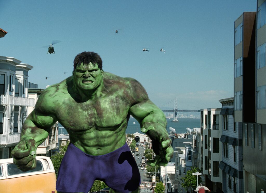
Eric Bana in Hulk

[EDITOR’S NOTE: In 2003, long before MovieManifesto.com existed, I spent my summer as a 20-year-old college kid writing as many movie reviews as I could. My goal was to compile them all into a website, possibly hosted by Tripod or Geocities, which would surely impress all of the women in my dorm. That never happened—neither the compiling nor the impressing—but the reviews still exist. So, now that I am a wildly successful critic actually have a website, I’ll be publishing those reviews on the respective date of each movie’s 20th anniversary. Against my better judgment, these pieces remain unedited from their original form. I apologize for the quality of the writing; I am less remorseful about the character of my 20-year-old opinions.]

The Hulk is perhaps the first comic-book adaptation that could ever be labeled pretentious. What we have here is not your run-of-the-mill, formulaic action flick in which exposition takes a back seat to explosion – far from it. Instead, acclaimed director Ang Lee brings us a film that generally forgoes action, alternatively attempting to present a more stylish, sophisticated picture. He endeavors mightily to create complex characters and place them in an emotionally involving story. It’s an admirable effort, and it’s encouraging that Lee refuses to be bound by the usual confines of the genre. But he fails. And when someone with the cinematic stature of Ang Lee fails, he fails hard.

The problem with The Hulk is that it lacks a center. There is no focal point, no pivot upon which we can focus our attentions and concerns. Lee is so fixated on style and uniqueness that he overlooks his characters, none of whom is nearly as well-developed as he pretends. Thus, as the machinations of the storyline unfold, we are not intrigued but isolated, hopelessly disconnected from the film’s events. This, combined with a plodding pace, render the movie a lackluster journey that struggles just to keep our interest. Read More

Spider-Man: Across the Spider-Verse: What a Spangled Web We Weave

Miles Morales and Gwen Stacy in Spider-Man: Across the Spider-Verse

It’s cinematic law that sequels need to be bigger, which presents a daunting challenge for Spider-Man: Across the Spider-Verse. Its predecessor, the spry and snazzy Into the Spider-Verse, was awfully big to begin with, taking a familiar superhero origin story—this one centering on Miles Morales (Shameik Moore), an affable Brooklyn teenager who receives that famous radioactive insect bite—and then bombarding the screen with many more Spider-Men (well, actually Spider-People… OK, technically Spider-Animals) who arrived from different realms in the multiverse. It was a whole lot of movie, as noteworthy for its energetic style—busy, boisterous animation that evoked the splash panels of comic books without devolving into pastiche—as for its hectic, cluttered narrative. How could a follow-up one-up such vibrant maximalism?

Quite cleverly, as it turns out. Fueled by a powerful cocktail of joy and ambition, Across the Spider-Verse steers into the multiversal skid, embracing its own storytelling paradoxes with delirious abandon. It’s a dizzying and at times exhausting movie, and it doesn’t entirely evade the trap of saturation that foils many blockbusters; as the latter Avengers pictures proved, more superheroes doesn’t always equate to more fun. But the filmmakers here—the credited directors are Joaquim Dos Santos, Kemp Powers (from Soul), and Justin K. Thompson, while the screenwriters are Dave Callaham and the ubiquitous team of Phil Lord and Christopher Miller (makers of The LEGO Movie)—have located the sweet spot between playfulness and gravity. It isn’t that Across the Spider-Verse refuses to take itself seriously; it’s that it seriously commits to itself as a work of childlike invention and artistic imagination. Read More

Guardians of the Galaxy, Vol. 3: Journey to the Center of the Mirth

Chris Pratt and Zoe Saldaña in Guardians of the Galaxy, Vol. 3

James Gunn is best known for his eclectic needle drops, but he also has a visual signature: the Right Stuff-style shot of a troop of swaggering warriors striding forward in slow motion as a pop song blares on the soundtrack. He delivers that image twice in Guardians of the Galaxy, Vol. 3, and while the second is more conventionally satisfying—the final prelude to some long-awaited interstellar ass-kicking—the first is more memorable. It’s noteworthy in part because the characters aren’t walking but floating, having just leapt from a spacecraft onto a bulbous planet (kindly shelve your astrophysical fact-checks), but what’s really striking is that each hero is outfitted in a bulky suit of a different bright color. There’s a simple beauty to the image, an eye-catching quality that’s rare for the Marvel Cinematic Universe—a cultural behemoth which, for all its commercial savvy and box-office supremacy, isn’t exactly a pioneer in terms of visual innovation. In this context, it’s oddly gratifying to be watching a superhero movie that actually cares what it looks like.

Let’s not pretend that Guardians 3 is some sort of aesthetic revelation. It’s still an MCU flick, which means it traffics heavily in green-screened locations, weightless special effects, and haphazard streams of light and fire. When an unknown gold-skinned invader (Will Poulter) zooms through the atmosphere and crashes into the chest of Rocket—the computer-generated mutant raccoon voiced by Bradley Cooper, and again embodied on set by the director’s brother, Sean Gunn—the impact is as forceful as that of a coder clacking away at their keyboard. But the value of James Gunn—the canny maneuver that helps distinguish the Guardians pictures from their costumed brethren—is his knack for minimizing the genre’s inherent drawbacks (sloppy action, dull world-building) while emphasizing his own vibrant strengths (sharp dialogue, giddy imagination). Sure, Volume 3 is yet another chaotic adventure involving a desperate rescue mission, a precious MacGuffin, and a megalomaniacal villain. But mostly, it’s a family vacation comedy. Read More

Ant-Man and the Wasp: Quantumania: A Bug’s Strife

Paul Rudd and Jonathan Majors in Ant-Man and the Wasp: Quantumania

The implicit assumption underlying the Marvel Cinematic Universe—the notion meant to infuse it with relatability and heft as well as imagination and excitement—is that its movies (and TV shows) take place in our own world. A fantastical version of our world, sure, but ours nonetheless; for every talking raccoon, purple titan, and junkyard planet, there’s a Los Angeles mansion, a Queens tenement, and an Oakland basketball court. The idea is that, while the narratives feature costumed superheroes and magic weapons, the characters’ behaviors and desires remain rooted in recognizable human experience. Sokovia may not be a real county, but the Washington Monument is at least a real building.

What’s potentially interesting about Ant-Man and the Wasp: Quantumania—the third movie centering on Paul Rudd and Evangeline Lilly as the titular insects (he’s the ant, she’s the wasp), and the gazillionth 31st big-screen installment in the MCU’s history (not to mention the first of Phase Five, whatever that means)—is that the vast majority of its action doesn’t take place on Earth at all. It doesn’t take place in outer space either, or on any other faraway planet. It instead mostly transpires in the Quantum Realm, a microscopic land full of alien life forms, misshapen creatures, and animate vegetables. And so, unbound by the usual obligation to chain his fanciful hijinks to the deadweight of realism, the director Peyton Reed (working with the screenwriter Jeff Loveness) appears to have stumbled into the rarest of opportunities: the chance to a make a mass-market superhero movie that’s genuinely weird. Read More