NOMINEES
Changeling – Tom Stern
The Curious Case of Benjamin Button – Claudio Miranda
The Dark Knight – Wally Pfister
The Reader – Chris Menges, Roger Deakins
Slumdog Millionaire – Anthony Dod Mantle
WILL WIN
Working backwards will only get us so far here, as the lone movie I’m comfortable eliminating right off the bat is The Reader – if it wins this category, Harvey Weinstein truly is Satan. I’m not quite as confident crossing off Changeling, mainly because it’s such an impeccably photographed motion picture, but there’s so little buzz surrounding Eastwood’s movie that I can’t see it pulling an upset.
This leaves three, and while the lazy strategy would be to ride Slumdog Millionaire’s coattails by default, history initially suggests this isn’t a wise option. No Best Picture winner has also won Best Cinematography since American Beauty in 1999 – that’s eight straight years of zeroes in the photography category for Oscar juggernauts. Strangely enough, however, the eventual winner of Best Picture didn’t even receive a cinematography nomination in five of those years. So while I’d like to be clever and throw out Slumdog Millionaire because I ingeniously discovered a secret Oscar plot that prohibits dual winners in the two (seemingly related) categories, I can’t because, well, I’m not that clever. Slumdog stays in.
(And just to satisfy your perverse curiosity, the five most recent Best Picture winners that failed to receive nominations for their cinematography include: A Beautiful Mind (made sense, more story-focused), The Departed (made sense, little noteworthy about its photography), Crash (made sense, the movie fucking sucked), Million Dollar Baby (perplexing), and The Lord of the Rings: The Return of the King. And yes, that last one still infuriates me. Simply put, the omission of Return of the King for Best Cinematography is unequivocally the most asinine Oscar snub of all-time, even worse than Leonardo DiCaprio for The Departed and Keira Knightley for Atonement. Just thinking about it reminds me of a scene from “The Wire”, when a newspaper editor defines the verb “incense” as “to inflame with wrath”. Well, that’s how I feel whenever I think about the exclusion of Return of the King for Best Cinematography. It incenses me. I am inflamed with wrath. Let’s move on.)
Anyway, instead of discounting Slumdog Millionaire, I’ll throw out The Curious Case of Benjamin Button. I certainly think it can contend in this category, but in terms of its craftsmanship, I imagine voters will focus more on its visual effects and makeup than its photography.
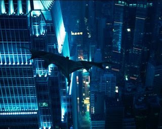
And so, as was the case with Best Editing, we’re left with a duel between the street rat and the Caped Crusader. Could The Dark Knight engender enough sympathy after its Best Picture snub in order to develop some momentum here? It’s possible – the Academy has never shied away of awarding this category to more action-oriented pictures (Crouching Tiger, Hidden Dragon, The Lord of the Rings: The Fellowship of the Ring, and Master and Commander: The Far Side of the World all won this decade). But those movies all featured natural shots of environmental magnificence and scenic beauty – Crouching Tiger showed us rich, verdant forests; Fellowship highlighted the splendorous mountains of New Zealand as though Peter Jackson had just discovered them; Master and Commander gave us the wide-open spaces of a majestic ocean. The Dark Knight, in contrast, is gritty and metropolitan – it was filmed either on set or on location in Chicago, and there isn’t a sunset or evergreen to be found. I just don’t think its aggressively modern photographic style is well-matched to older voters’ more artistic sensibilities.
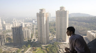
The cinematography in Slumdog Millionaire is by no means traditional – Anthony Dod Mantle’s camera spins and whirs constantly – but it does possess a defined sense of place. Whether or not the Mumbai depicted in Danny Boyle’s film accurately represents the actual locale is a question open to debate (and it sure is being debated to motherfucking death), but the Mumbai we do see is teeming with life, and Dod Mantle’s camera thrusts us into the thick of it. There’s a true sense of immediacy to the proceedings, a hyper-realistic “This is what it’s like!” kind of feeling, but there’s also pure moviemaking energy. This amalgamation of anthropological observation and filmmaking kineticism make Slumdog Millionaire a dizzying photographic achievement. Chalk it up for another Oscar.
SHOULD WIN
This is a decent batch of films in terms of photography, but it pales in terms of the powerhouse quintet in contention last year (that list of five still blows my mind). In fact, I think I prefer each of last year’s nominees to any of this year’s, which is mildly depressing. But anyway, the inclusion of The Reader here really perplexes me. Roger Deakins is a tremendous cinematographer – this represents his eighth Oscar nomination, and he should have landed at least two more (for The Village and Jarhead), plus see the Deserving section – but I can’t recall anything memorable about his and Chris Menges’ work on The Reader. I don’t mean to take anything away from the film – it’s a dramatically potent story with a thoroughly impressive cast – but it doesn’t belong here.
At least one can mount an argument for the remaining nominees. Changeling traffics mostly in dark, foreboding hues as befits its mystery story, with its camera cautiously investigating the shadowy corners of 1928 Los Angeles. It is, without doubt, impeccably shot, exuding skill from every frame; it is not, however, necessarily dazzling. This should by no means subtract from its artistic loveliness, but immature youth that I am, I like my cinematic beauty served with a side of flair.
Slumdog Millionaire certainly has that, but sometimes its decadence veers perilously close to gaudiness. The Dark Knight, on the other hand, maintains an impressive reverence for the art form even as it ventures into bombast. Throughout the film’s numerous electric action sequences, Wally Pfister’s camerawork is flawless in that it never calls attention to itself – it shows us extraordinary sights without feeling the pressure to reinforce their brilliance. That said, I can’t shake the feeling that this shrewd restraint is more courtesy of director Christopher Nolan’s unyielding command than Pfister’s skill operating the camera. (Ironically enough, I felt the same way about Nolan and Pfister for their previous collaborative effort, the sublime thriller The Prestige.)
Like Changeling, The Curious Case of Benjamin Button is also impeccably shot (though unlike Changeling, it flirts with lighter, more peaceful tones as it follows its protagonist’s descent into a beautiful but lonely world), but it is not without a sense of majesty. There are a number of splendidly photographed sequences – the submarine attack comes immediately to mind – but I just can’t stop thinking about its last shot. Effects-driven or not, it is the most heart-wrenching image shown in theatres all year (with a possible exception featured in the Deserving section), and it is executed with such simplicity and grace as to achieve perfection. That level of mastery cannot be ignored, and it is indicative of the quality of the photography throughout the film. And that’s why The Curious Case of Benjamin Button is my winner.
DESERVING
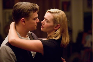
Revolutionary Road – Roger Deakins. They must have mixed up the envelopes again – Deakins should have been nominated for this, not The Reader. Director Sam Mendes’ pictures have always been beautiful; his first two (American Beauty and Road to Perdition) earned well-deserved cinematography Oscars for Conrad Hall before Deakins glided in effortlessly to assist on Jarhead after Hall’s death. One might think that Revolutionary Road, with its muted suburban setting, wouldn’t cater to gorgeous photography, but Deakins is more than capable of finding beauty in the mundane. There’s an iconic shot of hundreds of men in grey flannel suits descending a train station staircase, soldiering forward into the dreariness of their day jobs (think “Mad Men” minus the sense of humor).
The most lasting image for me, however, is a steadicam shot of Kate Winslet that occurs near the film’s end. Deakins’ camera frames her tightly from behind, showing her looking out a paned window, almost as if she is behind prison bars (Mendes used a similar shot to more satiric effect in American Beauty). After lingering over Winslet’s still body for several seconds, the camera pulls back, ever so slowly, producing a reveal that is downright haunting. I won’t spoil it, but it’s an absolutely devastating image. A mere camera maneuver that results in genuine catharsis for the audience is a rare and precious thing – Deakins does it here.
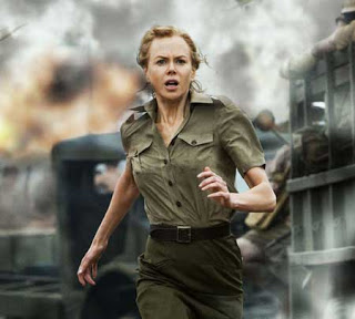
Australia – Mandy Walker. Australia symbolizes everything I like about movies. It is bold, heedless, and occasionally nonsensical, but it sure is fucking entertaining. The photography is exquisite, offering a number of marvelous views of the Australian landscape, as well as a remarkable shot of a herd of cattle stampeding toward a cliff-face. Naturally, the movie barely made one-third of its budget back at the box office. Figures.
Appaloosa – Dean Semler. Westerns sure do look sweet.
Jeremy Beck is the editor-in-chief of MovieManifesto. He watches more movies and television than he probably should.


“The Dark Knight, in contrast, is gritty and metropolitan – it was filmed either on set or on location in Chicago, and there isn’t a sunset or evergreen to be found. I just don’t think its aggressively modern photographic style is well-matched to older voters’ more artistic sensibilities.”
Exactly how old are these “older” voters, who apparently developed their preferences in the visual arts during the English Romantic period? For gritty, metropolitan photography, check out Brassai’s “Paris de nuit” — published in 1933.
They’re pretty old. The general outcry from supporters of “The Dark Knight” was that it was excluded from major categories because Academy members were incapable of properly relating to a movie that engaged so actively with the mainstream audience. I’m not as violent in my disapproval as some, but in general I agree that the Academy tends to pass over mainstream box-office successes, even if they’re finely crafted, in favor of smaller, more artistic pictures.
Looking back, most cinematography winners are either historical (often war-themed) films or those set primarily in the natural environment. “Road to Perdition” may serve as a counterexample, but that was too beautiful to ignore, and it was also a period piece. In fact, other than “American Beauty”, the last winner of the category to take place during the present was “Close Encounters of the Third Kind”, all the way back in 1977.
You make a good point about the Academy’s visual appreciation of nature and historical scenes, but that is different than the question of whether the photographic style of “The Dark Knight,” and not just its setting, can with rights be called “aggressively modern.” I haven’t seen the film; in the trailer, Gotham looks more like Fritz Lang’s “Metropolis” (1927) than ever.
Furthermore, it’s a mistake to label “The Dark Knight” too mainstream for the Academy. All the movies in this category are thoroughly mainstream; what distinguishes “The Dark Knight” is that it’s juvenile.
It’s aggressive in that it’s very active. There isn’t anything as stylized as the “Matrix” movies, but the camera is rarely still, especially during the virtuoso motorcycle sequence. “Slumdog Millionaire” is active as well, but it’s also steeped in naturalism. Granted, I’m conflating cinematography with production design, but I think that’s a natural alliance.
I define mainstream as something that achieves awareness (and often, by extension, box office success) from a mass audience. People may have heard of “The Reader” and “Milk”, but few have actually seen them, so they’re hardly mainstream. (I believe there’s an article somewhere detailing that “The Reader”, “Milk,” and “Frost/Nixon” form the lowest-grossing trio of Best Picture nominees ever.)
And come on man, how can you label “The Dark Knight” as “juvenile” when you haven’t even seen it?
You’re right to point out how difficult it is, especially in the age of computer enhancement, to judge cinematography independently of editing and general visual design. Also, I see now what you mean by calling “The Dark Knight” too modern for the Academy. But I think you’ve chosen the wrong terms.
What you want to frame as a debate between the forces of modern, mainstream culture on one side and the stodgy orthodoxy of the Academy on the other, is actually a question of movie-goer demographics. “The Dark Knight” is a film intended for the thirteen to twenty-something audience. This, not coincidentally, is also the section of the American public that most frequently goes to the movies — a blockbuster is born. But since the Academy chooses its members by their accomplishments, only rarely does a twenty-something (e.g., Keira Knightley) get to participate in the voting.
The Academy is passé only if you make modernity synonymous with youth culture, and its selections are underground, fringe films only if you define the mainstream as the contents of youth culture. The Academy is made up of people who work in the mainstream film industry and it unfailingly nominates the most mainstream films made in a year, giving less emphasis to those made primarily for the teenage and young adult audience. I put “The Dark Knight” in this category not to dismiss it, but to show what is distinctive about it in comparison with the other films you discuss. The terms of your argument force you to characterize the Academy as somehow both too traditional and too heterodox, whereas my argument also sheds light on its alleged under-appreciation of WALL-E.
The award is for achievement in cinematography. Because cinematography is a highly technical aspect of film making, you can't just judge it on how it fit the theoretical ideals of the film (or by giving it a generic label of "gritty" or "contrasty"). I would say that regardless of whether the movie is mainstream, indie, or a teenage girl movie, the achievements in a category should not be shadowed by the target audience. Completely new rigs were created to shoot the film in IMAX and Pfister didn't do a DI. Were the other nominees beautiful? Absolutely and they were recognized, but when it comes down to ACHIEVEMENT in cinematography, I think that Pfister deserved the award.
Yeah, it's just a matter of perspective. Having never been to film school and being generally ignorant of the finer details of filmmaking, I tend to evaluate movies based on their final product, not their process. So when I'm analyzing cinematography, I examine how a film looks to me as an audience member. While Pfister's work may have been revolutionary in terms of the process employed, I can only look at the ultimate result, and when it came down to it, I felt the photography of "Benjamin Button" was superior from the audience's standpoint.
The only issue with that is that an Oscar is supposed to be an award that represents the voting and opinions of the peers of people working in the industry. When the Oscars come down to what the audience saw rather than what was actually deserving, then there's almost no point to having an Oscar. It would be like having a best computer contest, and me saying "that computer should win because it has a really nice outside." Bejamin Button looked great, but what made it Oscar worthy were the special effects, not the cinematography (that's not at all to say that it didn't deserve the nomination it got).